Friday, December 10, 2010

MFA Exhibition Review: YOU ARE HERE I AM


The first year MFA exhibition turned out to be an interesting show. The show was hung well, clean, simple, and well spaced.  From a curatorial standpoint, most of the rooms seemed to flow nicely. I commend their efforts to create a professional looking show.  However, I did not like the method in which they chose to display the artists’ names. Whenever I walk into a gallery, I typically pick up the press release on my way out so that I am not carrying around pieces of paper while looking at the artwork. This also allows me to reflect on the work of the show before seeing what the gallery’s goals for the show are. So when I first walked in, I did not even see the map on the table. As I was walking through the show I kept wondering who the artists were and why the MFA students had decided not to include the names.  Typically when I go to a show, I will write down the artist’s name or the name of the piece so that I can refer back to it later, however it was difficult to do for this show. Since I have worked in that gallery for this class, and know the layout, I was able to decipher from the many pictures I have taken that include the orientation and layout of the rooms, the names and titles of the pieces. I do however, think that the design of the map and the color chosen for the sign were nice. The title of the show is simple and appropriate; the audience is obviously here, at the show. Since this is an exhibition displaying the talent of the MFA students, “here I am” is a statement that is perhaps saying “this is me, this is my artwork, here I am for you to view.” 
Doug McLean "Untilled"
One of the grad students came in and critiqued my classes’ paintings because my teacher was absent. After looking at my artwork, he told me to view the artwork of Doug McLean.  His work relates to my current paintings in the level of abstraction and simplicity. McLean has abstracted a pumpkin into flat simple shapes. His palette for this set of paintings is very restricted. He predominantly uses two colors in each of these paintings. Then, he creates a shade of each of these colors. What makes these paintings interesting is that the intensity and value of each color is the same. 

Doug McLean "Untilled"
The light red is the same intensity as the light purple and the dark red is the same intensity as the dark purple. I am unsure of his process, but I wonder if he did these paintings simultaneously and used the same palette for each painting. Throughout the paintings there are similar reds and purples and if they were done concurrently this allows for the manipulation of the colors. It is interesting to see what happens when the red is placed on a dark background, then in the foreground, then in the negative space and how that red changes depending on the colors it next to. This is a concept that I am working on in my own paintings. I want to continue to explore the relationships of color through placement and space, which is a concept McLean seems to be working on. I was happy to see this type of work in the show, and overall satisfied with the show in general. However, I was pretty disappointed in the amount of photography in the show, or perhaps photographers in the program. Since I am a photograph major, it is always nice to look at the work of others in similar programs.

Friday, November 19, 2010

Studio Journal

A professor recently showed me the work of Sparky Camponella. His series 40 over forty directly relates to the idea of beauty and the self-consciousness that women feel, and how they are ashamed of their aging body. While I will not be shooting full nudes, I hope that I will be able to photograph women who are able to rise above the scrutiny just as these women have. I'm planning to shoot this pproject with a 4x5 camera so that all of the details will be picked up, and it is interesting to see that Camponella used the same type of camera.

Wednesday, November 17, 2010

Studio Journal

I recently started to look at the work of a photography, Elinor Carucci. Her work is very personal and mainly revolves around her family. In her new series My Children there is a striking image of her nude body after a emergency c section and child birth. It is a difficult image to look at so I will not be posting it here. It can be found on her page http://www.elinorcarucci.com/recent.html . In a documentary I saw of her she discusses how she could not believe the way her body had changed since pregnancy. She was upset with the change but she said that taking a picture of her body acted as a type of photo therapy. Carucci became at peace with the way she had changed. For my next series I will be photographing parts of a women's body that they may feel uncomfortable or self-conscious about. Many women are unhappy or dissatisfied with the way their body looks and I intend to illuminate their issues. However, by photographing these parts of the body, I hope this serves as the same time of photo therapy and realization that the model's body is fine the way it is.

Studio Journal


I recently completed my series for October. This series was an exploration into a friend of mine and how she looks, as well as how her space looks when she does not expect to be seen. In working with her it became apparent that she is comfortable with herself. I hope to continue with this idea and do few more women in the same fashion.

Friday, October 15, 2010

Studio Journal

For thesis, I've been thinking about women and how they see themselves. For my next photography series, I'm going to investigate the identity of women when they are alone. When there is no one to impress, no reason to dress up. I will be taking pictures of who women are when they are by themselves. I'm going to start shooting today, and this weekend.

Friday, October 8, 2010

Studio Journal

One of my professors recently told me to look at the painter Joan Semmel because I'm interested in painting the figure. What began to interest me about her work was the idea that she paints herself as she sees herself. The angles from which she paints her body, as well as the reflections in the mirror are the only ways in which a person can see their own body. I think I'm going to explore this concept more in my next series for photography.


Studio Journal

These pictures were shot for my September series for my class. We were given an open ended assignment with the requirement of 10 prints. I’m continuing to work with the body and the figure as well as color and light. 


Welcome Back Show Review

Lyda Craig Tales from Holoscene, 1997
This piece is composed of different views of cropped pigs. The pigs are depicted in ways that show the role of the boars over time. In the bottom right there is a picture of man fighting a boar, and the in the upper left corner there is a of a boar depicted similarly to cave drawings. Craig layers these images of pigs and divides the canvas with a horizontal line of pigs which are pushed to the foreground. She also introduces a vertical thrust by depicting a two headed man. She may be investigating the relationship of man of these animals. Man fights the wild boars in one image, and the other two pigs seem to be the type used for meat. Many of the images in her exhibition centered around mythological creatures and tales. I think by incorporating the different images of the pigs,  such as the skeleton of what may be a primitive boar, gives the boars a mythological place in the history of man.

Suzanne Joelson Easter West, 2010
This piece paired well with the piece it was presented next to because of the similar palette used to construct them. What aided in this similarity was the color of the frame of the pice to the left of this one. This piece is painted with a painterly style, the brush strokes are left in the piece and looks like they were painted with a broad brush. The forms layered on top of the broad vertical strokes creates a strong sense of figure/ground. While the forms are organic, the piece retains a certain geometric quality because the forms divide each canvas into four quadrants. This play of geometric and organic forms work well with Lindblom’s piece because of this relationship. Allison Lindblom’s work, Untitled, is a flat piece concerning grids and geometric forms. The white triangles which decrease in size seem to recede back into space. However, that space is skewed because of the figures juxtaposed. In this work it is difficult to establish what is the figured or the ground.

Allison Lindblom, Untitled, 2010. 
Bryan Whitney Neo Kabbalah, 2010
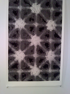
 These three works, were all in the entry gallery space. Many of these work incorporate geometric abstraction. Many of these works were presented in different medium and it was interesting to see how they worked together. Whitney’s piece fit into the show as it deals with geometry and grids as many of the other pieces did. The forms created in this piece are not perfectly geometric, as one might expect them to be based on the complex grid. None of the white intersections of the lines are quite the same. This dissimilarity in the forms plays off the strict grid lines. 

Interview with Jennifer Shauger

J:These are some of my influences here, like Ed Ruscha, he documented the 26 gas stations, and he also did word painting using expressive typography.


K:What draws you to Ed Ruscha’s photography?


J:I don’t know what it is, I think it’s the rawness of it, he documenting what’s there and maybe he sees it as beautiful, and in my work I like to do things that are beautiful to me. There is a lot of old signage in these gas stations, which is interesting. Also in his work with his word paintings, you wouldn’t think they were by the same guy, but it is. There’s a certain beauty to his work.


K:Have you looked at other artists that do documenting type of work?


J:I just saw someone today named, Allan Hess. He took pictures of Rt. 66 and the countryside. It’s beautiful because there are no distractions, technology, or advertisements like it is today.


K:So you like the old feeling to his work?


J:Yea, I think pre technology and pre saturation of media and everything sort of pollutes your brain, it has a nice calmness to it.


K:You are graphic design but in your work you use photos, do you do photography as well.


J:I wouldn‘t say that I’m a photographer; I enjoy doing it as a hobby. If I have to use photographs in a project, I wouldn’t particularly take pictures from online, I would rather take the pictures by myself. If I had to use a picture like a ship, I would obviously take the pictures off line.


K:When you have access to it you would rather use your own imagery?


J:It makes it more personal, which I think is an important element in any kind of work


K:Instead of it being an assembly of stuff you’d rather use your own pictures?


J:I think adding any personal element to work whether it be design or photography, if its something you find beautiful in design whether it be hand rendered type or your own photography like James Victor he does hand painted typography and hand painted illustration.


K:I think it turns a lot of people off to being graphic designers, they may think that “I have to use text, I have to use these things,” and they don’t feel they’re going to have the same freedom.


J:A lot of people do see design as being strictly the computer but that’s what makes it so great as long as you are revealing an idea or trying to convey a certain concept. Any kind of materials you can use to try and achieve that work as long as you can form a solution to the problem that needs to be solved. A scribble can be used and as long as it conveys the idea, then it works.


K:Where are you trying to go with your work? Personally I don’t’ really know what the facets of graphic design are. Will you be going to go into commercial product packaging design or signs?


J:I have such a broad interest in design, there’s so many aspects to it, there is packaging identity, advertising, book design, there so many aspects to it so whatever is open and anything I can find to utilize my own interest. Within that, I always wanted to work for penguin books, all their book covers are amazing and a lot of designers I look up to have worked for them and that would be really cool.


K:What would your ideal job be like?


J:Working at a really big design studio. That’s sort of wishful thinking. I would be doing book covers or branding.


K:What is branding?


J:More like logos and everything like McDonalds is a brand, if you think bout it everything is a brand like Rutgers is a brand, you see signage out on the street. TV shows are a brand as well. Everything is really a brand, which is good for designers


K:You’d never run out of work.


J:But at the same time technology is taking over and leaving designers of out of jobs. Everything’s pretty much the computer, especially ipads and kindle, what about book covers?


K:I would still rather read a book but for a lot of people it’s convenient to not have huge stores of books around the house.


J:I like getting books and just having them, and reading them, even pictures or novels.


K:It’s sort of like photography; I think there’s something much better about the print then just looking at a file on the computer.


J:I’ve always been interested in these little booklets that I make, things that you can keep and collect, and when it’s digital it’s not as fun to click on it. I like being able to have something tangible. It shows you how design evolves because you can look at it in 20 year and look how things were being designed then.


K:Do you like using the computer?


J:I do, but like breaking away and using other stuff.


K:Like going back to using a typewriter?


J:Exactly, using a typewriter, photography, and hand drawing things. The fusion of that makes the design more interesting. You have to think about every kind of way to design.


K:A common theme in your work is the rounded edges what is the idea behind it?


J:I should have never gotten one of those things from Michael’s. It’s an old aesthetic that I find beautiful.


K:There’s a lot of work that you did that has the rectangle inside the rounded corners.


J:I collect a lot of stuff like these postcards. Lots of a them have those rounded edges and they have the nostalgic aesthetic. I really don’t know why, I find myself being more attracted to older things.


K:Like the photos of the old signs, but even though they’re new pictures the rounded makes them look older.


J:There’s certain decay to it that I find beautiful. Like what was and what used to be and is not longer, is interesting to me. When things become obsolete and what makes them obsolete. It all goes back to evolution and progress, which is hard to deal with sometimes.

Sunday, September 19, 2010

Water Show Review


Water Show Review
The Water Exhibition at the Zimmerli Art Museum showcases artwork from a variety of pieces that art mostly pulled from the museums own collection. Although the pieces are from different sections of the museum such as nonconformist soviet art, american art, european art, and russian art, they are unified under the theme of Water and how it appears in art. The exhibition is divided into six sections into which the works are grouped and displayed in different rooms. The first room is about the nature of water. The curator formed the room based on a large photograph of an Iceberg by Lynn Davis. This picture shows the nature of water in its three forms; solid, liquid, and gas. This piece sets the tone for the rest of the works in the room such as the Condensation Cube, the Geoffrey Hendricks pieces about clouds, and the Francisco Infante pieces, Wanderings of a Square which showed water in its liquid form and water as clouds. The Geoffrey Hendricks pieces paired with the Infante piece is interesting because of the uses of three different media to show clouds. Topics such as “women in water men in boats”, “divine water”, “water in the landscape”, and “urban water” were displayed in the exhibit with equally cohesive pairings and works of art. In the “Urban Water” section, there were two large series centered around fountains and faucets that complimented each other very well.
The curator’s intentions of creating an experience through this exhibition came through very well. While walking through this show, the viewer is encapsulated by the water because the curator has chosen to paint the walls shades of blue as well as include subtle sounds of the ocean playing throughout the show. The curator’s intention was to bring about a greater awareness to the importance of water and display its many purposes in life, as well as in art. During the tour, curator Donna Gustafson said that when moving the pieces from different parts of the museum and juxtaposing them with other pieces, “everything changes and it becomes a new work of art.” All of the work took on new meaning and displayed how water is essential to life. This show should definitely be seen.


I’ve selected these five works to be placed together because I highly enjoy non-western art. Although “The Wave” is not non-western art, I believe it captures the spirit that these artists capture in their paintings. It is interesting to see how non-western painters perceive nature and how they translate their feelings onto the scroll. They concentrate not on portraying nature how it is, but rather the essence of nature and the relationship they have with it. This can be seen in Hiroshige’s power ocean/sea paintings showing the strength as well as the beauty of water. In Privat-Livemont’s lithograph, the woman seems to be receding peacefully into the ocean. These pieces capture our relationships with the water through their portrayal and depiction of the scenes.


Ando Hiroshige, Mannen Bridge, Fukagawa

Ando Hiroshige, The Sea at Satta, Suruga

Xiao Chen, Valley and Mountains

Henri Privat-Livemont, The Wave

Komori Soseki, Goldfish